 11 Best AI Data Visualization Tools That Save Hours in 2025
Staring at spreadsheets for hours, trying to make sense of complex data sets? You’re not alone. AI data visualization has transformed what used to take days into a matter of minutes. However, choosing the right tool can feel overwhelming with dozens of options flooding the market. Each […]
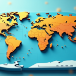 How to Make an Animated Map with Ease: Tips and Tricks
When did you last notice a static map in a presentation? Probably never. That animated route tracking an experience across continents likely captured your attention. Most people think creating an animated map requires professional design skills. Modern tools and technologies have made the process […]
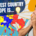 EU Countries Ranked by IQ – Map Animation
https://www.youtube.com/watch?v=VbRBkCHU2zg In this Video, we move across the map of Europe to show the Average IQ of each country in the EU. Which is the smartest country in Europe? This Map Animation video is created with After Effects. Contact us if you need a similar video for your business! […]
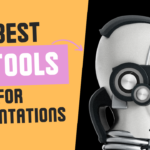 Top 5 AI Tools for Auto-Generating Presentations in 2023
Artificial Intelligence (AI) has permeated various aspects of our lives, changing the way we work, play, and interact with the digital world. One such area where AI has made a significant impact is in the creation of presentations. With AI, you can now create visually stunning and engaging […]