

Visualize global oil trends with Barbachart. See the shift in maritime chokepoints and learn how to create your own data animations with Data Story Maker.
Portfolio
3 posts

The World No. 1 ranking in tennis is more than just a number—it’s a testament to sustained excellence, mental fortitude, and the ability to defend a throne against the best in the world. In this latest data visualization project for the BarbaChart portfolio, we dive into the history of the […]


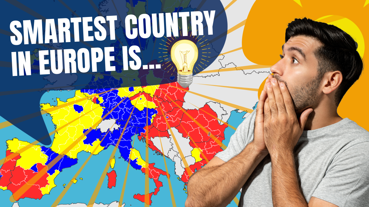
In this Video, we move across the map of Europe to show the Average IQ of each country in the EU. Which is the smartest country in Europe? This Map Animation video is created with After Effects. Contact us if you need a similar video for your business!