Published on Barbachart.com
There is a mistake almost every data video creator makes, and it happens before they open a single application, before they touch a dataset, before they even decide what topic they want to cover. The mistake is starting with the tool.
It goes like this: someone discovers bar chart races, or gets excited about a new plugin, or sees a slick animated line chart go viral on LinkedIn. The reaction is immediate — I want to make one of those. So they go looking for data that fits the format they already have in mind. They find something vaguely interesting, drop it into their workflow, render it out, post it. And then they wonder why it gets forty views.
The format was fine. The data was real. The execution was competent. But nobody felt anything watching it.
That is because a chart, no matter how well animated, is just a container. What fills it — what actually reaches people — is a story with an emotional centre. And the only way to find that is to go to the data first, without a chart type already loaded in your head, and ask a different question: what is this data trying to say about human experience?
The Emotion Is Already in the Numbers
Every dataset that has ever gone viral shares one quality: it makes the viewer feel something before they even fully understand what they are looking at. It triggers recognition, or disbelief, or a sense of injustice, or the particular pleasure of watching something inevitable play out in slow motion. The best data videos do not explain — they reveal.
Consider what Hans Rosling did with a bubble chart in 2006. The data itself — income per capita plotted against life expectancy across countries over two centuries — had existed in academic databases for years. Nobody had gone viral with it. Rosling did not find better data. He found the emotional hook buried inside the same numbers: the story of convergence. The story of the gap between the rich world and the poor world quietly, stubbornly closing. He named that arc, built tension around it, and let the animation make the argument for him.
That is the discipline. Not “what data can I visualize?” but “what is the human arc inside this data?”
Five Sources Where That Arc Already Exists
The good news is that some of the richest storytelling datasets in the world are completely free. You do not need proprietary data or expensive subscriptions. You need the patience to look for the narrative before you look for the chart.
Our World in Data (ourworldindata.org) is the single most generative free resource available to data storytellers. Every dataset on the platform has already been cleaned, sourced, and — crucially — framed around a research question that implies a human story. The child mortality numbers alone contain decades worth of video content: the sheer scale of the reduction since 1950, the countries that bucked the trend, the years where progress stalled and why. The emotional register is hope, which is rare in a media landscape saturated with decline narratives. A bar chart race built from those numbers does not need a voiceover to land. The movement tells the story.
Gapminder (gapminder.org) is where Rosling’s legacy lives on as open data. Beyond the famous income and health indicators, Gapminder holds long historical series on education, gender equality, and energy consumption that span centuries in some cases. The emotional territory here is perspective — the corrective feeling of realising the world is different from how you imagined it. That feeling is extraordinarily shareable.
FRED — the Federal Reserve Bank of St. Louis Economic Data (fred.stlouisfed.org) is where you go when you want data with teeth. Wages adjusted for inflation over fifty years. The gap between productivity growth and compensation. Housing affordability across decades. These are datasets with genuine social tension built in, and that tension is immediately legible to almost any adult viewer who has ever worried about money — which is nearly everyone. The emotional hook here is not hope or wonder; it is recognition. Viewers watch the chart and think so it wasn’t just me. That impulse to share something validating is one of the most reliable engines of virality.
The UN Comtrade Database (comtradeplus.un.org) is underused by content creators and wildly overqualified for it. Bilateral trade flows between every country pair in the world, going back decades. The stories hiding in there are genuinely cinematic: how China’s share of global manufacturing shifted in a single generation, how a trade war reshapes the map of who sells what to whom, how a pandemic reroutes supply chains in real time. These are subjects that dominate the news cycle but are almost never shown in motion. An animated flow chart built from Comtrade data can make abstract geopolitics feel physical and immediate.
Spotify Charts and Billboard Historical Data (available via Spotify’s API and the Billboard archives) give you the cultural layer that purely economic or demographic datasets cannot. Music consumption data is interesting precisely because the emotional response is already embedded in the subject matter. Watching hip-hop’s share of streaming time grow from a regional phenomenon to a global dominant format over fifteen years triggers a completely different feeling than watching GDP figures — it feels lived in. People remember where they were. That personal resonance is what makes cultural data so potent for social sharing.
From Data to Motion: Where Most Creators Get Stuck
This is the part of the process that used to require either expensive software or a deep technical skillset — or both. You have found your emotional hook, you have cleaned your data, you know the story you want to tell. Now you need to turn it into something that moves.
That gap between spreadsheet and final video used to swallow enormous amounts of time. It is also where a lot of the creative momentum goes to die, because the moment you are debugging After Effects expressions or wrestling with keyframes on forty data points, you have stopped being a storyteller and become a technician.
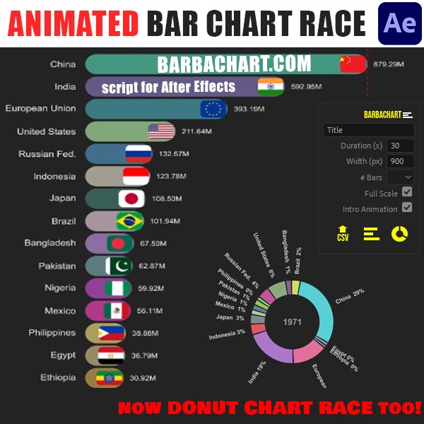
This is exactly the problem that Data Story Maker was built to solve. As a plugin for both Adobe After Effects and Adobe Premiere Pro, it takes your prepared data and generates animated chart sequences directly inside the tools you are already working in — bar chart races, line chart timelines, ranking sequences, and more — without requiring you to manually animate a single element. The story you identified in the data stays intact because you are not losing creative energy fighting the production pipeline. You go from cleaned CSV to animated sequence in minutes rather than days, which means you can iterate, try different chart types, test different emotional framings, and still meet a publishing schedule.
For the kind of storytelling described in this article — long historical arcs, country comparisons, cultural shifts over time — the workflow becomes straightforward: find the arc in the data, shape it in the spreadsheet, bring it to life in Data Story Maker, and finish it in Premiere or After Effects with your usual colour grading and sound design.
The Question to Ask Before You Open Any App
Before you import a dataset, before you open Data Story Maker or any other tool, before you even decide on a chart type, sit with the data for a moment and ask one question: if I described this to someone at a dinner table, what would make them stop eating and lean in?
It might be a number that seems impossible. It might be a trend that reverses exactly when you expect it to continue. It might be a country that does something no other country does, or a decade that breaks a hundred-year pattern. That moment — that instinctive sense that something here is worth paying attention to — is the story. Everything else is production.
The charts are not the point. The feeling is the point. Start there, and the rest of the process has somewhere to go.
Barbachart.com is home to tools, tutorials, and resources for data-driven motion designers. Data Story Maker is available for Adobe After Effects and Adobe Premiere Pro.