Data Story Maker turns CSV files into broadcast-quality animated charts directly inside Adobe Premiere Pro and After Effects. Below is the full library of chart types currently shipping in the panel, grouped by use case. Charts marked NEW were added in the latest release.
🌍 Maps
Geographic storytelling — race the globe between locations or shade an entire world map by your data values.

World Map Chart Race
An animated 3D globe spins between cities or countries on a journey, dropping pins, flags, and labels along a dotted great-circle path. Two label modes: compact tags or full call-out cards with a typewriter reveal and a second descriptive line.

Choropleth MapNEW
Shade every country on a flat world map by a numeric value, with countries popping in one at a time from lowest to highest. Each labelled country pops a pin, draws an orthogonal call-out, and types its name plus value into a sized-to-fit card.
🏁 Animated Races
The signature chart-race format made famous on social media — values battle for the top spot frame by frame.

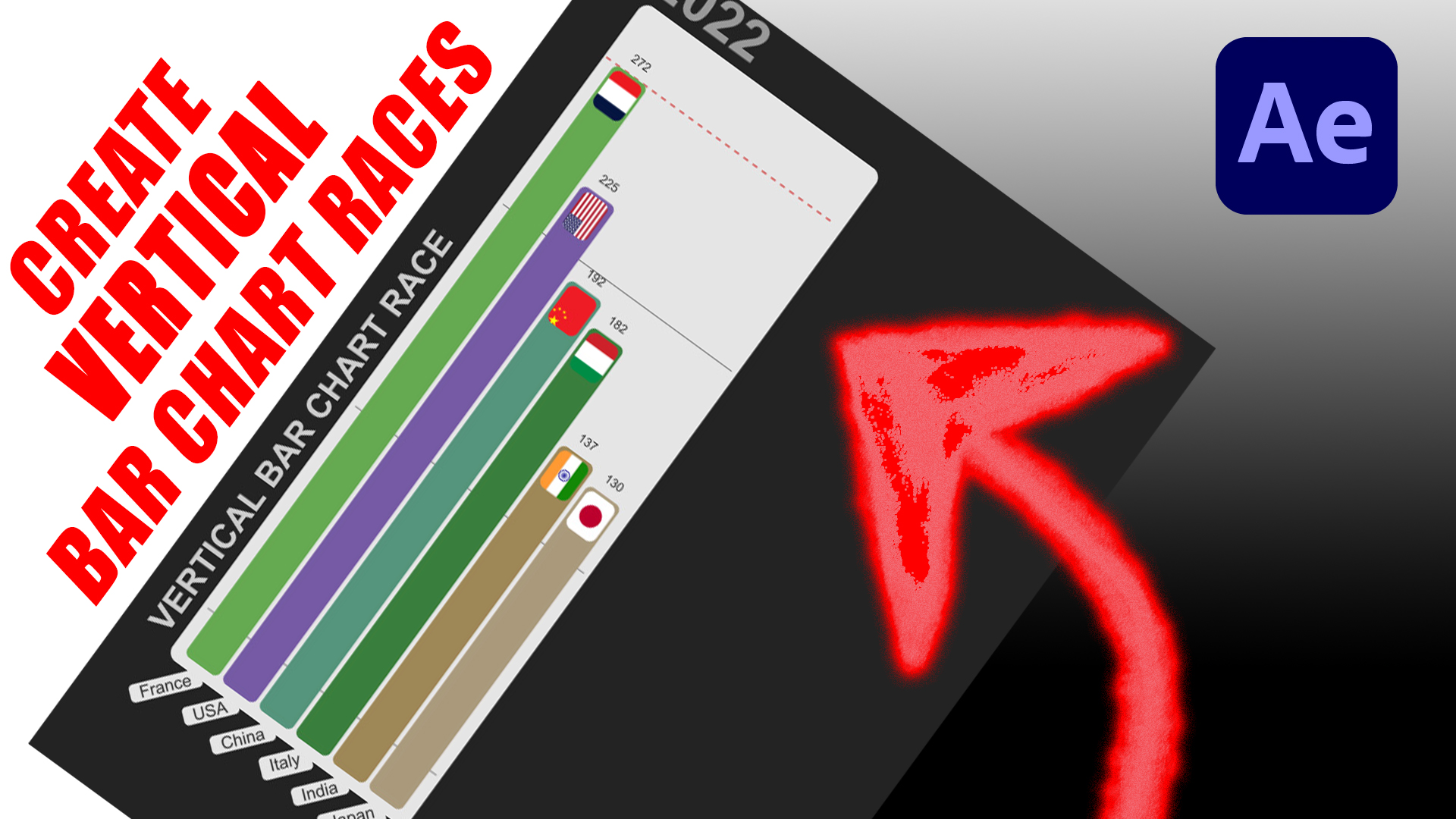
Bar Chart Race
The classic — horizontal bars race up and down the ranking as the years (or any time axis) tick by, with smooth interpolation between data points and dynamic axis scaling.

Cumulative Bar Chart RaceNEW
A running-total twist on the bar race: instead of resetting each period, bars accumulate their values as the time axis advances, so the ranking reflects who’s ahead on the cumulative tally frame by frame.

Stacked Area Chart RaceNEW
A streamgraph-style flowing river of stacked categories that builds left to right, perfect for showing composition and growth at the same time.

Crazy Bar Chart Race
A wilder spin on the bar race with bouncy physics and exaggerated motion — built for high-impact social clips where attention-getting movement matters.

Line Chart Race
Multiple series race across the canvas, tracing their trajectories as the playhead advances. Ideal for trend comparisons over time.

Line Chart Race 2
An alternate styling of the line race with bolder labels, accent dots tracking each series, and a refined axis treatment for a cleaner editorial look.

Bubble Area Chart Race
Bubbles sized by value drift across the canvas with smooth physics, growing and shrinking as their data evolves frame to frame.

Bubble Y-Axis Chart Race 2
Bubbles plot vertically against a value axis while expanding and contracting in size — great for showing two dimensions of change simultaneously.

Bubble Y-Axis Chart Race 3
A third variant of the bubble race with tweaked easing, label callouts, and a denser layout suited to richer datasets.

Bubble Chart Race — Christmas Edition
A festive seasonal skin on the bubble race. Snowfall background, holiday palette, and warm typography — drop in your year-end stats and ship.

Ranking Table RaceBETA
A live leaderboard where rows reorder themselves as values change, with rank numbers, animated swaps, and per-row accent colors.
📊 Static Charts
Animated reveals on classic chart types — bars, slices, and radial layouts that build in over your timeline.

Bar Chart
A clean grouped or single-series bar chart that animates bars up from the baseline. Smart axis labels, custom palette, and per-dataset images.

Pie Chart
Slices fan out from 12 o’clock with eased motion. Each segment carries its label, percentage, and value — ready for the title card or the explainer.

Donut Chart
The pie chart’s modern cousin, with a clear hole in the centre that’s perfect for placing a hero number, brand mark, or summary stat.

Radial Area Chart
A circular area chart where each category sweeps outward as a coloured wedge. Designed to highlight share-of-total in a high-impact, eye-catching layout.

Bubble SqueezeNEW
Value-sized bubbles tumble in and jostle for space, packing themselves into a tight cluster with playful physics — a lively way to show relative magnitude.

Sankey DiagramNEW
Flowing ribbons trace how volume moves between stages or categories, with band thickness scaled to value — ideal for budgets, energy flows, and conversion paths.

Waffle ChartNEW
A grid of squares fills in to show proportions and parts-of-a-whole at a glance — a clean, modern alternative to the pie for percentage stories.

Dumbbell ChartNEW
Two connected dots per category mark a before-and-after comparison, with the connecting bar animating in to reveal the gap. Ideal for showing change, disparities, or the range between two values.
🎯 Funnels
Conversion stories told as a tapering funnel — vertical or horizontal, with three switches to fine-tune the look.

Funnel ChartNEW
A top-down conversion funnel where each stage tapers to the next. Toggle curved vs. straight segments, percentage labels, and proportional vs. even sizing — all from the panel.

Horizontal FunnelNEW
The same funnel laid on its side, stages flowing left to right. Per-stage percentages sit above each segment with a mini fill bar so the drop-off reads at a glance.
⏱️ Counters & Timelines
Number-driven moments — countdowns, progress, milestones, and tactile flip-board displays.

Countdown
A bold animated countdown timer for launches, deadlines, and event opens. No CSV needed — just pick a duration and ship.

Progress Bar
A clean progress fill that runs 0 → 100% with a synced numeric counter. Ideal for percentage milestones or campaign goal trackers.

Timeline 1
A horizontal milestone reel where each event slides in along the timeline with title, date, and description. Great for project recaps and product histories.

Timeline 2
An alternate timeline layout with a single focused milestone card that animates between events — best when you want each moment to land before the next arrives.

3D TimelineBETA
Milestones rendered as cards in 3D space using Three.js, sliding past the camera in a cinematic carousel. A premium look for keynote-style storytelling.

Split-Flap CounterNEW
Airport-departure-board style flip tiles for stat reveals. Each character cycles through random flips before landing on its final value — pure tactile drama for KPI moments.

Odometer CounterNEW
Rolling mechanical-style digits spin up to your final number like a car odometer — a tactile, satisfying reveal for totals and milestones. No CSV needed.
Get Data Story Maker
All charts above are included in the panel — install once, render any of them inside Premiere Pro or After Effects from a CSV. Need a chart type that isn’t on this list? Tell us what you’d like to see.
Ready to transform your data stories? Visit https://barbachart.gumroad.com/l/datastorymaker to get started with Data Story Maker.