
When did you last notice a static map in a presentation? Probably never. That animated route tracking an experience across continents likely captured your attention. Most people think creating an animated map requires professional design skills. Modern tools and technologies have made the process surprisingly straightforward. You can create animated […]
data storytelling
4 posts
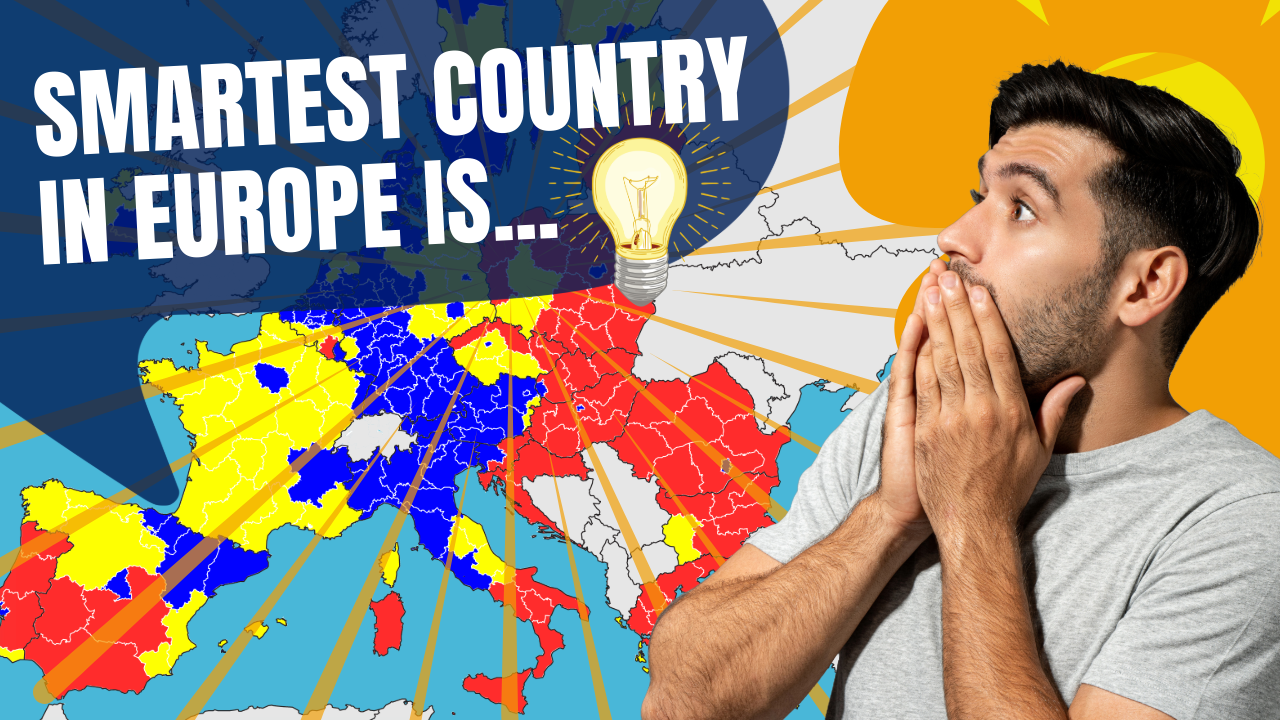
In this Video, we move across the map of Europe to show the Average IQ of each country in the EU. Which is the smartest country in Europe? This Map Animation video is created with After Effects. Contact us if you need a similar video for your business!

Data visualization is an essential tool when it comes to presenting complex information in a clear, engaging, and digestible manner. Among the many types of data visualizations, line chart races have emerged as a powerful and captivating way to tell stories, compare trends, and reveal insights over time. In essence, […]

Data Storytelling is one of the most effective ways of communicating data-driven insights. It’s a powerful technique that can help you make sense of complex data and present it in a way that people can understand. In this article, we’ll look at the concept of data storytelling and the importance […]