Data Storytelling is one of the most effective ways of communicating data-driven insights. It’s a powerful technique that can help you make sense of complex data and present it in a way that people can understand. In this article, we’ll look at the concept of data storytelling and the importance of data visualisation. We’ll also explore the different types of data visualisations and how to make your data come alive. Finally, we’ll discuss the power of data storytelling and courses for data storytelling and data visualisation.
What is Data Storytelling?
Data storytelling is the process of communicating data-driven insights through visualisations and narrative. It’s a powerful way to communicate complex data in a way that people can understand and relate to. It helps to bring data to life and make it more engaging and meaningful.
Data storytelling is about more than just presenting beautiful data; it’s about telling stories that can help people understand the data. It helps to make data more accessible and engaging, and can be used to bring insights to life and make them more memorable.
Data storytelling is a skill that requires both technical knowledge and creative thinking. It involves understanding the data, interpreting it, and communicating it in a way that’s easy to understand. It also requires being able to tell stories that can help people to understand the data and draw insights from it.
Data storytelling is becoming increasingly important as data becomes more accessible and important to businesses. It’s an essential skill for data scientists and other professionals who need to communicate data-driven insights.

Benefits of Data Storytelling
Data storytelling has many benefits, including:
- It helps to make complex data easier to understand.
- It helps to draw insights from data more quickly.
- It can help to make data more engaging and memorable.
- It can help to bring data to life and make it more meaningful.
- It helps to make data more accessible and actionable.
- It can help to make data more persuasive and persuasive.
What is Data Visualisation?
Data visualisation is the process of representing data in a visual format. It’s a way to communicate data-driven insights in a way that’s easier to understand. Data visualisation can help to make data more accessible and engaging.
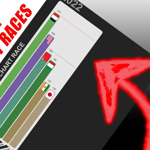
Data visualisation can take many forms, including charts, graphs, maps, Bar Chart Races, and infographics. It’s a powerful way to communicate data-driven insights and make them more meaningful.
The Importance of Data Visualisation
Data visualisation is an essential part of data storytelling. It helps to make data more accessible and engaging. It can also help to draw insights from data more quickly and effectively.
Data visualisation can help to make data more persuasive and actionable. It can also help to make data more memorable and meaningful.
Data visualisation is also an important tool for businesses. It can help to make data more accessible and actionable. It can also help to make data-driven decisions more quickly and accurately.
Data Visualization is massively used in big companies, banks, financial institutions, insurances and wherever there is need to present data to either shareholders, important clients or business stakeholders.
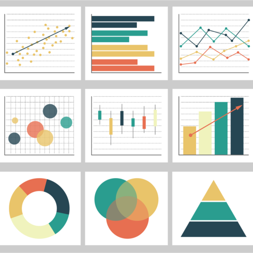
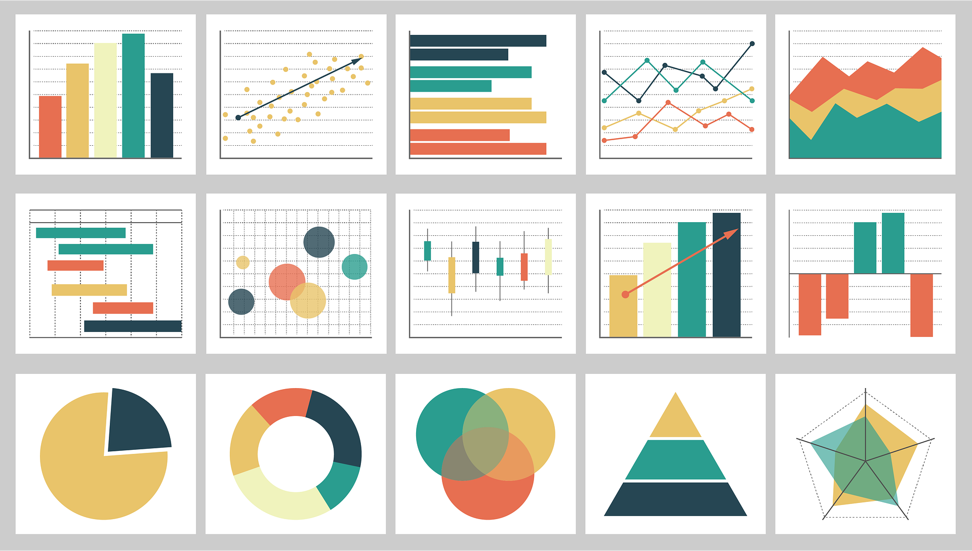
Types of Data Visualisations
There are many different types of data visualizations. Some of the most common types are:
- Charts: Charts are a type of data visualisation that can be used to represent data in a visual form. They can be used to represent numerical data and compare different values.
- Graphs: Graphs are a type of data visualization that can be used to represent relationships between different data points. They can be used to visualise trends and patterns in data.
- Maps: Maps are a type of data visualisation that can be used to represent spatial data. They can be used to visualise location-based data and compare data across different geographical areas.
- Infographics: Infographics are visual representations of data that can be used to communicate complex data in a more engaging and accessible way.
Best Data Visualization tools
How to Make Your Data Come Alive
Data storytelling and data visualisation can help to make your data come alive. Here are some tips for creating beautiful data visualisations and data stories:
- Choose a visualisation that best suits your data: Different visualisations are better suited to different types of data. Take the time to explore different types of visualisations and choose the one that best suits your data.
- Make sure your data is accurate: Before you start creating your data visualisation, make sure your data is accurate and up-to-date.
- Use colour to draw attention: Colour can be used to draw attention to important elements in your data visualisation. Use colour to highlight key insights and make your visualisation more engaging.
- Tell a story with your data: Data storytelling is about more than just presenting data; it’s about telling stories that can help people understand the data. Use your data to tell a story that can help people to understand the data and draw insights from it.
- Keep it simple: Keep your data visualisation simple and easy to understand. Too much detail can be overwhelming and make it difficult to understand the data.
- Make sure your visualisations are accessible: Make sure your visualisations are accessible to everyone. This means ensuring that they can be viewed on any device and are accessible to people with disabilities.
- There are many programming languages to create data visualisations you can use. Either you start learning one of them, or you can hire a professional Data Visualisation expert to help you.
The Power of Data Storytelling
Data storytelling and data visualisation can be powerful tools for communicating data-driven insights. They can help to make complex data more accessible and engaging. They can also help to make data more persuasive and actionable.
Data storytelling and data visualisation can be used to tell stories that can help people to understand the data and draw insights from it. They can help to make data more memorable and meaningful.
Data storytelling and data visualisation can also help to make data-driven decisions more quickly and accurately. They can help to bring data to life and make it more accessible and engaging.
Courses for Data Storytelling and Data Visualisation
There are many courses available for data storytelling and data visualisation. They can help to teach you the skills you need to communicate data-driven insights in an engaging and meaningful way.
If you’re looking to learn more about data storytelling and data visualisation, here is a list of online courses and resources available. These courses can help to teach you the skills and techniques you need to become a successful data storyteller and data visualiser.
Data Visualisation with Tableau
Master the Concepts of Data Visualization and Storytelling
Conclusion
Data storytelling and data visualisation are powerful tools for communicating data-driven insights. They can help to make data more accessible and engaging, and can be used to draw insights from data more quickly and effectively. They can also help to make data more memorable and meaningful.
If you’re looking to learn more about data storytelling and data visualisation, there are a number of courses and resources available. These courses can help to teach you the skills and techniques you need to become a successful data storyteller and data visualiser.
Data storytelling and data visualisation are powerful tools for communicating data-driven insights and making data come alive. They can help to make data more accessible and engaging, and can be used to tell stories that can help people to understand the data and draw insights from it.
If you need an advice or a consultation, do not hesitate to get in touch with us!
The easiest way to get in touch with us is by sending an email to info (at) barbachart.com
You can also get in touch through our BarbaChart Facebook Page or our BarbaChart LinkedIn Page
