Step 1: Create a new Composition
Create a New Composition in 600×600, 29.97 FPS, and 10 seconds long. This is just an indication, but you can use your own dimensions of course.
Step 2: Create the labels
Use the text tool to create a new text layer and write the following as content
Milan: 150
Paris: 130
New York: 170
Los Angeles: 190
Please keep the same format, with the : and the new line, so that you will be able to use this label as Data source as well. By changing one of the values, you will be changing the bars as well!
Rename the Text Layer to myText, by pressing enter while the old name is selected. Just the name will be changed, while the text on the layer will remain as before.
Step 3: Create a Circle Layer
Double click the Ellipse tool to create a big circle. Set the width of the stroke to 15 with the color you prefer and delete the fill.
Rename the layer to 1, (I really mean the number 1) by pressing enter while the old name is selected.
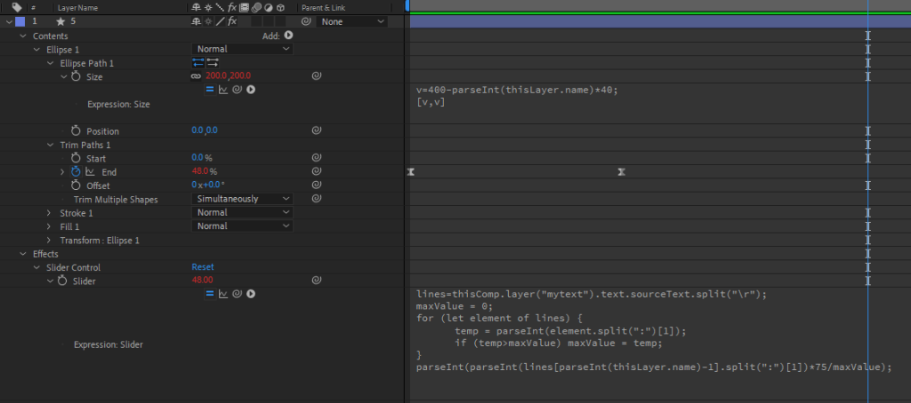
On the layer, go to Contents – Ellipse 1 – Ellipse Path 1 – Size, then Click on the Stop-Watch while pressing ALT (or Option on a Mac) on the keyboard. Write the following code on the Expression:
v=400-parseInt(thisLayer.name)*40;
[v,v]
From the effects and presets menu, select the Slider Control and add it to the layer.
On the layer, go to Effets – Slider Control – Slider, then Click on the Stop-Watch while pressing ALT (or Option on a Mac) on the keyboard. Write the following code on the Expression:
lines=thisComp.layer("mytext").text.sourceText.split("\r");
maxValue = 0;
for (let element of lines) {
	temp = parseInt(element.split(":")[1]);
	if (temp>maxValue) maxValue = temp;
}
parseInt(parseInt(lines[parseInt(thisLayer.name)-1].split(":")[1])*75/maxValue);
Now, Click on the ADD icon on the left of content, on the same layer, then choose TRIM PATH.
Then go to Trim Path 1 – End.
Go to the first Frame on the Timeline and then click on the stopwatch of END, to create a keyframe. Set the value to 0. Press F9 to modify it from linear to easy ease.
Then go to around one second on the timeline and modify the value of END to 100. This should create a second keyframe.
Now, let’s create an expression, always on the END property: so ALT (or OPTION) key + Click on the stopwatch, then write the following code inside the expression:
value * effect("Slider Control")("Slider")/100Step 4: Duplicate the Bar Charts
Now, the first bar layer should be ready. Let’s create the others by duplicating the first one.
Select the layer called 1 you were working on and duplicate it 3 times with CTRL-D (or COMMAND-D on a Mac). You should now have 4 radial bar layers with the correct Values.
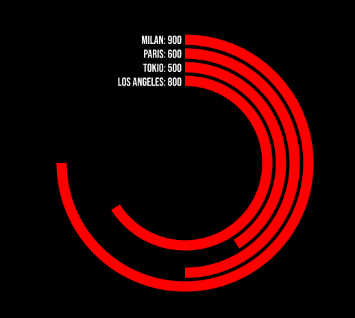
And that’s it. you have your radial bar chart, driven by the values in the text label. Just position the label in the correct position by modifying Fonts, size and position of the text layer!
Subscribe to our mailing list to receive Free Data Visualization related emails, free projects and discounts for our plugins!


