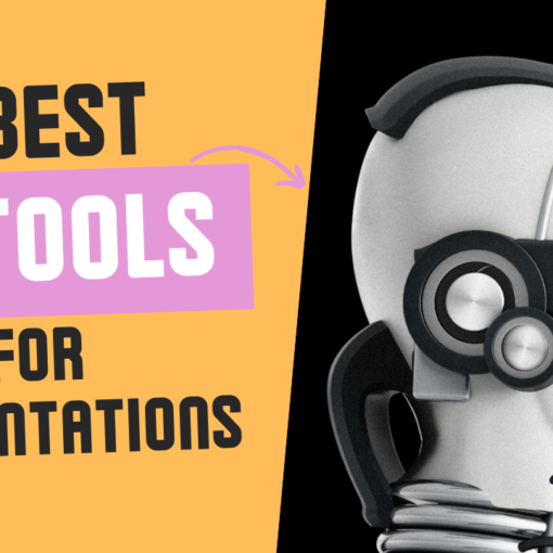
Artificial Intelligence (AI) has permeated various aspects of our lives, changing the way we work, play, and interact with the digital world. One such area where AI has made a significant impact is in the creation of presentations. With AI, you can now create visually stunning and engaging presentations in […]
BarbaChart
13 posts
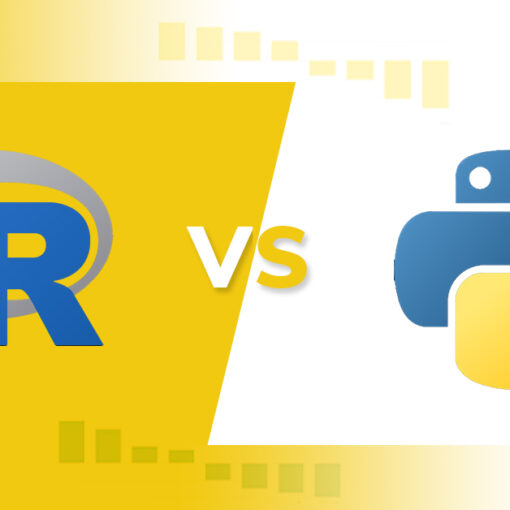
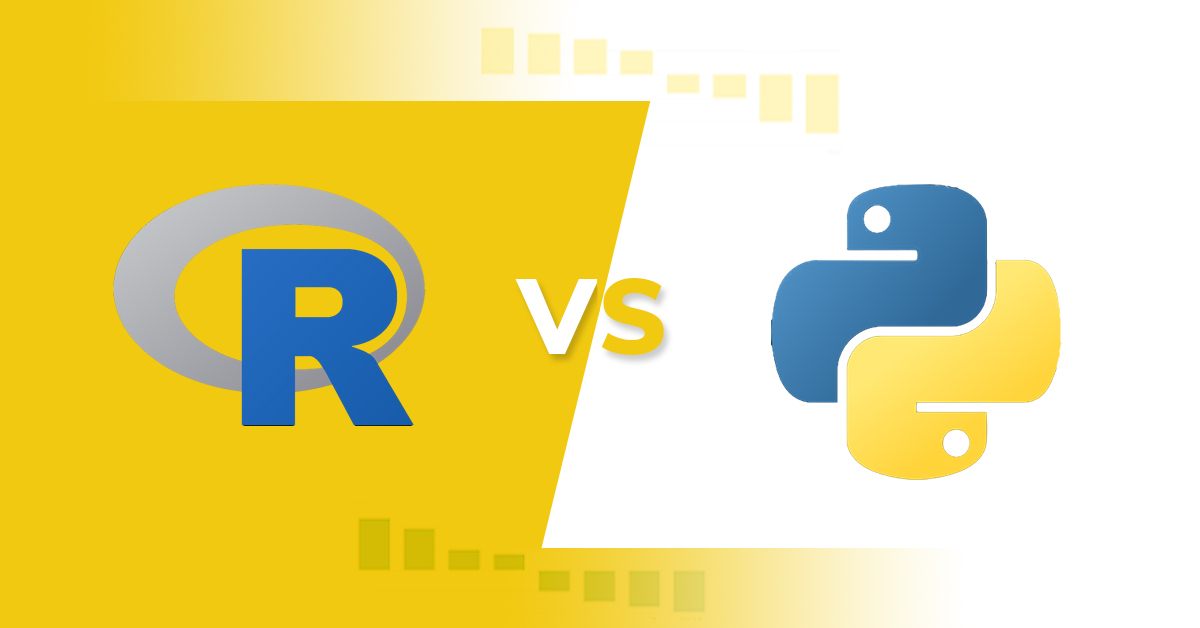
In the world of data analysis, two programming languages have emerged as the most popular tools for the job: R and Python. Both languages have their own unique strengths and weaknesses, and both have extensive libraries specifically designed for data analysis. In this article, we will explore the key differences […]
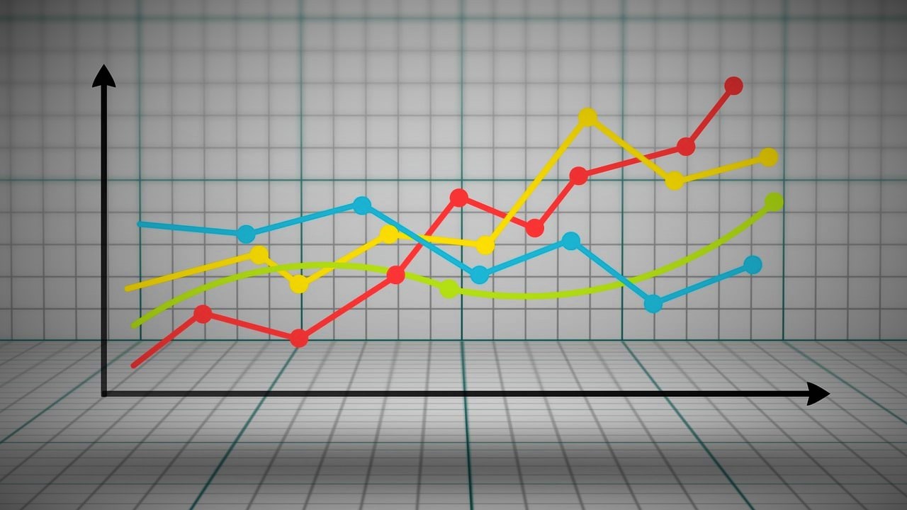
Data visualization is an essential tool when it comes to presenting complex information in a clear, engaging, and digestible manner. Among the many types of data visualizations, line chart races have emerged as a powerful and captivating way to tell stories, compare trends, and reveal insights over time. In essence, […]
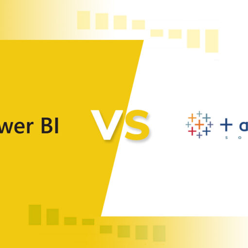
As data becomes increasingly important for businesses, the need for tools to help visualize and analyze data is growing. Data visualization tools help businesses make sense of large amounts of data and improve decision-making. In this article, I will compare two of the most popular data visualization tools, Tableau […]

As a data analyst, I know how crucial it is to work with clean data for effective decision-making. Dirty data can lead to inaccurate insights and ultimately, wrong decisions. Therefore, data cleansing is an essential step in any data analysis process. In this ultimate guide, I’ll take you through everything […]

Introduction to Data-Driven Decision Making In the modern age, businesses have access to vast amounts of data that can be used to inform their decisions. This data can be used to make decisions that are more informed, timely, and accurate. This process of data-driven decision making is revolutionizing the way […]

Data Storytelling is one of the most effective ways of communicating data-driven insights. It’s a powerful technique that can help you make sense of complex data and present it in a way that people can understand. In this article, we’ll look at the concept of data storytelling and the importance […]
Data visualisation and animation are essential tools for conveying complex information in a concise and easy-to-understand way. While there are a variety of programming languages that can be used for these tasks, some are better suited for the job than others. Whether you’re a novice programmer or an experienced one, […]
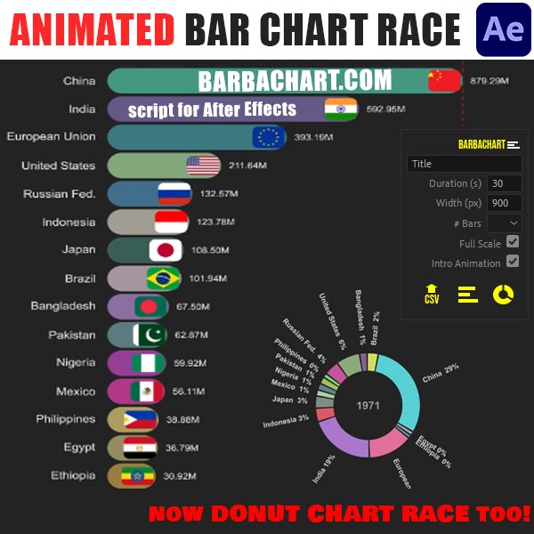
Bar Chart Races have become popular in the last years, mainly because of the statistics about the Pandemic. They compare things on one attribute, over a long time period. You may already have seen chart races of the most popular YouTubers or songs, but some of the most eye-opening races […]
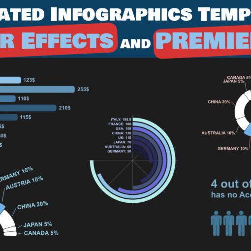
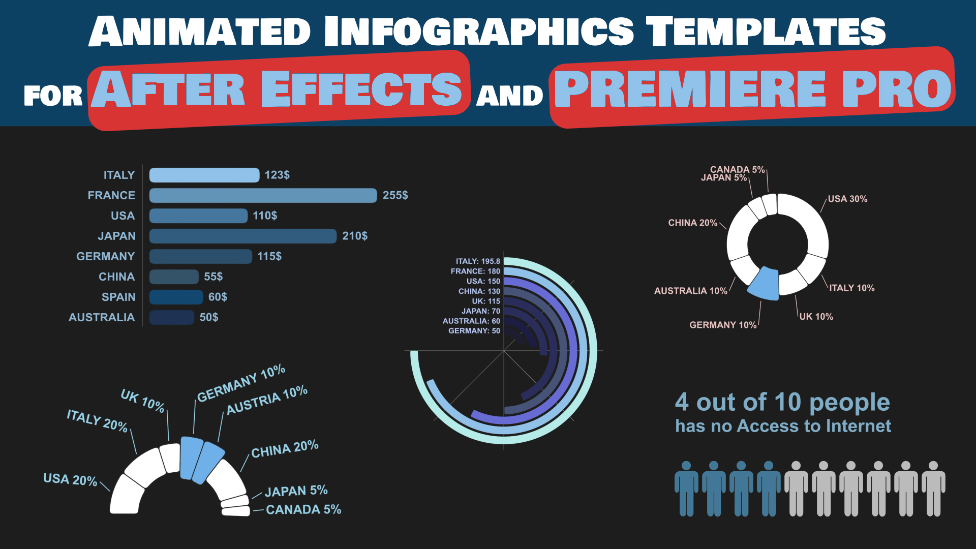
With our infographics templates, you will have just to import them in After Effects or in Premiere Pro and use all the graphs and charts